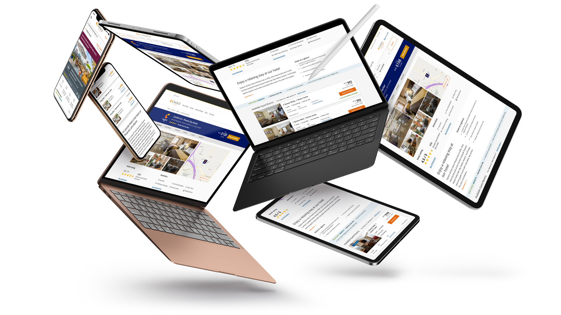
A big part of my job at Choice Hotels has been working on continuous improvements to the booking path for our guests. For about a year, I spent time exclusively working on the property & rates pages lauching tests with the team to see how we can help our guests make better, easier choices while booking with us. This is just a sampling of what we did.
My Role
Client
Website
One thing they don't tell you enough when getting in to product design is just how much the process changes from idea to idea. It's fluid and sometimes takes far less steps. We used analytics, user feedback, and guest insight as a starting point for all of these improvements. Then we moved to testing everything in A/B tests and the occasional user test (when needed). We always allowed time to thoroughly think through the best solution for any opportunity or problem.

The foundations of the desktop property page were incredibly good, but often took up a lot of space and pushed valuable content too far down the page. We used our analytics insight and some communication with actual guests to find out what mattered the most to them when booking a room.
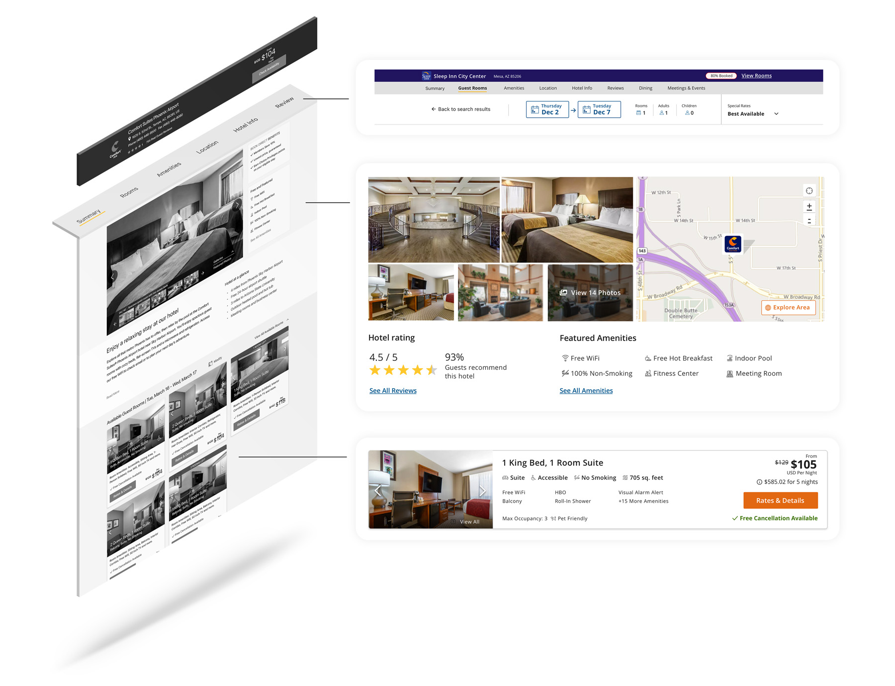
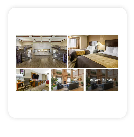
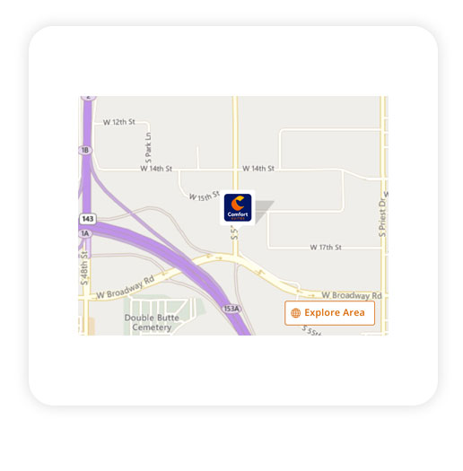
We wanted to be very careful on presenting too much information to the guests when they landed on the property page. We carefully tested several elements in phased approaches to make sure nothing would be causing problems for people looking to book our hotels.
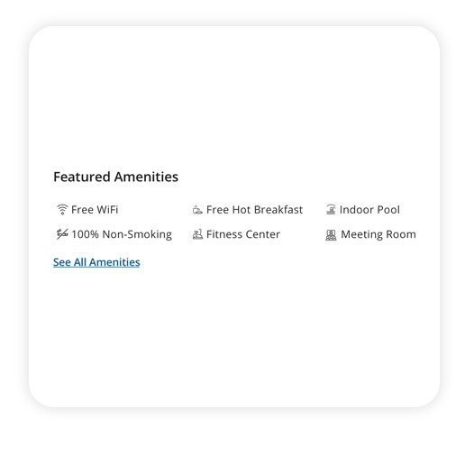
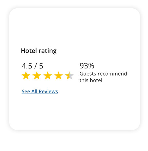
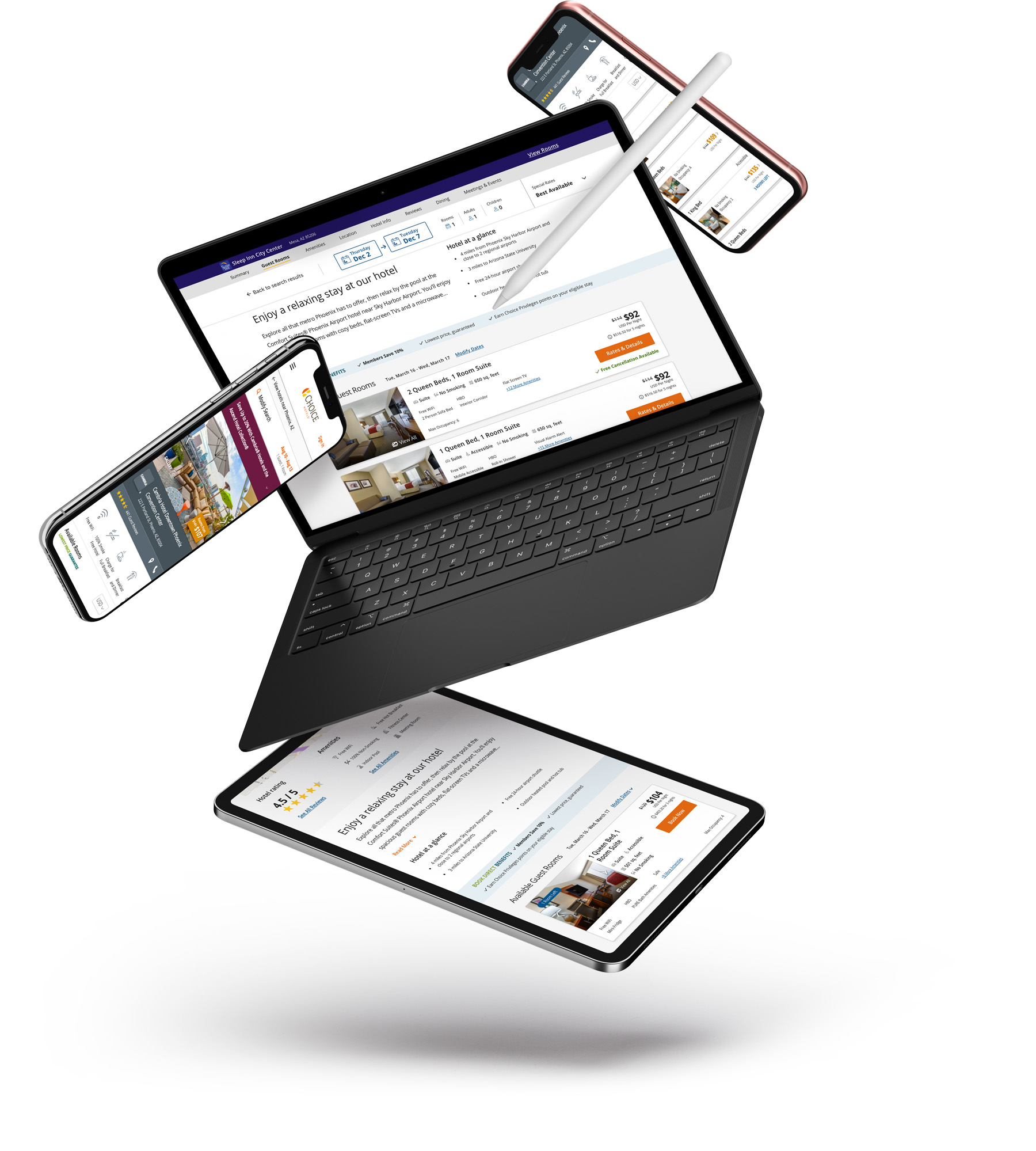
A big change people may have noticed is we added the actual rooms of the hotel on the property page like our mobile website has. This was already tested by another designer on the team a few months before. Once we saw the validation we needed, I took the design to a new level to make it a permenant part of the new booking flow and scalable for future features & opportunities.
Curious about the process, interesting learnings, or want to talk more about my process? I am more than happy to talk about my experiences so far and the amazing things the team & I were able to do, so email me at contact@joshuareach.com to set up a time to chat.