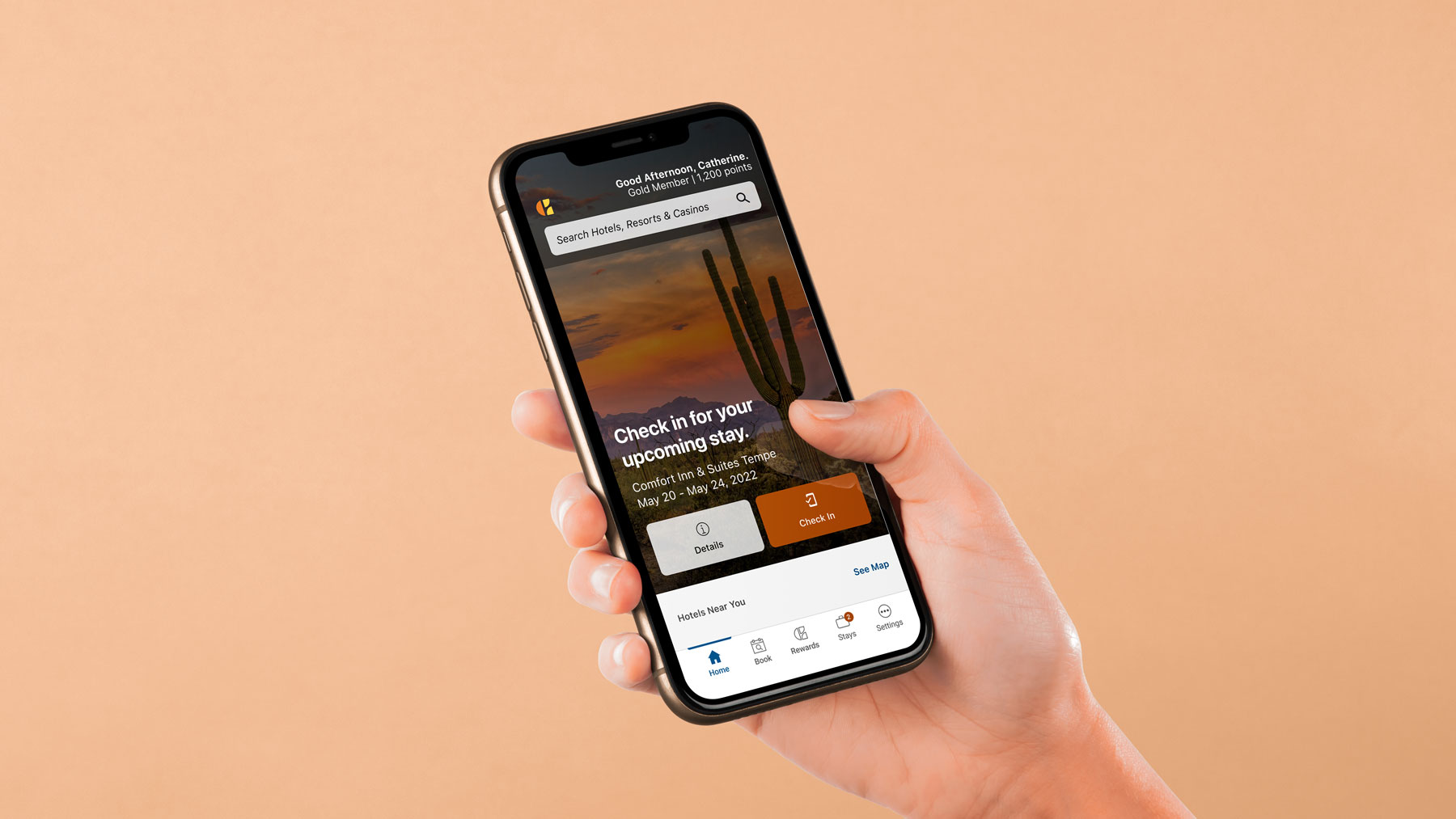
Spring of 2022 I join the mobile app team at Choice Hotels as their lead UX designer. Right as I joined, the team was already in the works on a massive project with a fantastic consultant at the helm - digital check-in. This won’t be your ordinary design story, as my role had to adapt quite a bit as I was passed the controls for one of the biggest updates to the Choice Mobile app in years.
My Role
Client
Website
Ok, it really wasn’t, but any designer will tell you that coming into a project while it’s well into concepting is a bit strange. Especially when you ultimately have to take full control of the project and bring it across the finish line.
That said, my role when I first joined the app team (and this project) was to work along side an incredibly talented outside design consultant (shoutout to Corie!), who had been working on the project for a few weeks already. I helped with user testing, building out use cases & scenarios, and getting into closer talks with the developers & engineers on making this digital check-in work. Once the consultant's contract was up, I carried the project across the finish line with the talented group of engineers.

Digital check-in at hotels is nothing new, so it was clear what the benefits of this service in our mobile app was. If you’re actually reading this far, you’re probably like, “Josh! What are those benefits?” - to which I say, “Hold up, I’m not publicly posting the details here.” Let’s chat later about that if you’re actually interested.
The quick summary is this benefited two key groups though in multiple ways: the guests and the hotel staff. Time was the biggest saver for both parties involved.
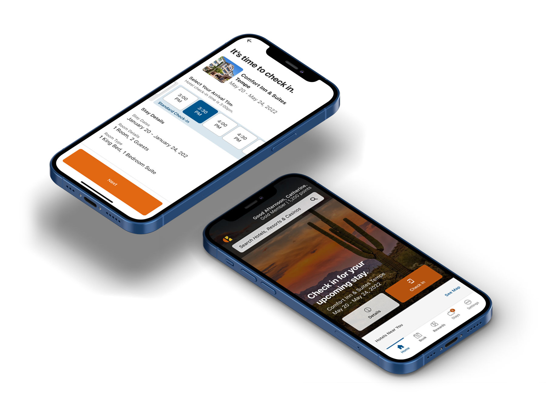
One of my favorite things about creating products is bringing the designs (or wires) to engineers and stakeholders to have them poke holes. Stress the design out. That’s exactly what I did with the engineers as well - we collectively pushed the design to every scenario possible from different payment options to accessibility tests of large UI settings on a phone.
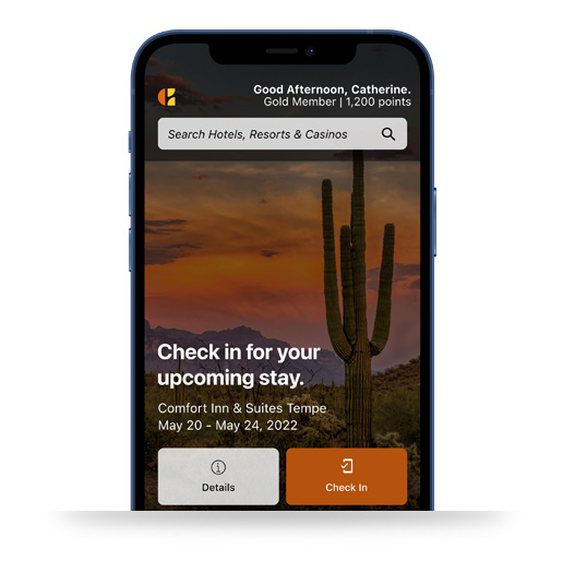
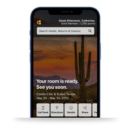
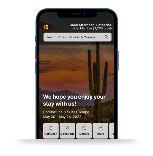
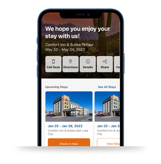
Much to our surprise, we were asked to also sneak in a new look for the mobile app home screen. This meant a totally refreshed look to begin the app on its new journey of a fresh UI.
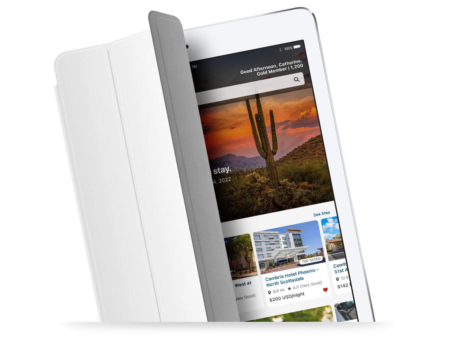
Now, naturally us designers would have liked to do more of a design system update, which means approaching the app hollistically from an atomic design standpoint - identifying components to refresh throughout the app vs just on one screen.
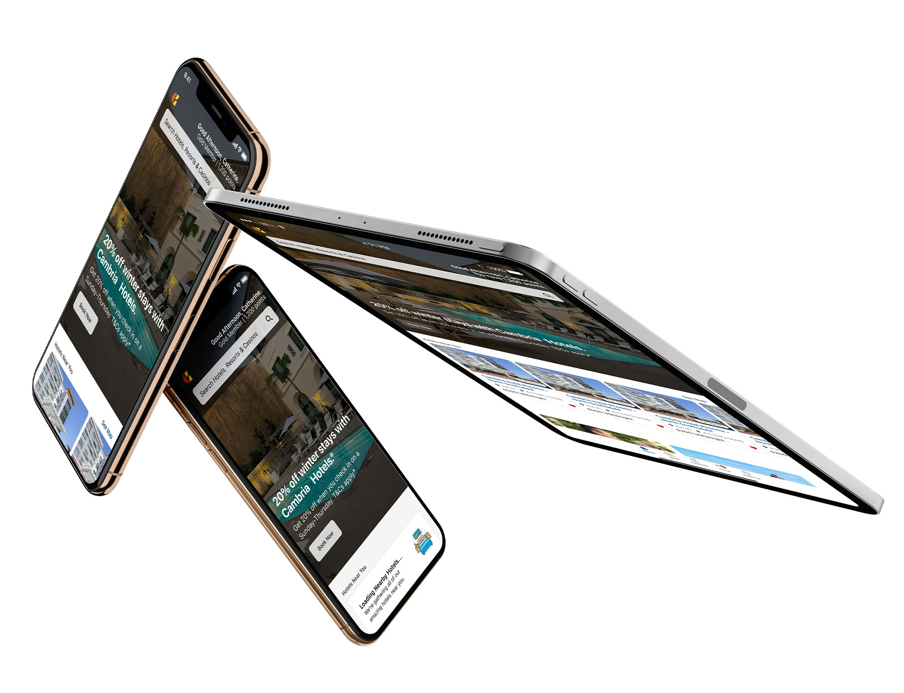
I can’t help but think I was a little bit of the cause of this crazy hit to the home screen. Before I even knew I was joining the app team, I was teaching myself how to use Figma (we used Sketch at the time), and used the app Home Screen as a test subject. I shared some of those ideas with leadership and, well, you can see what happened next.
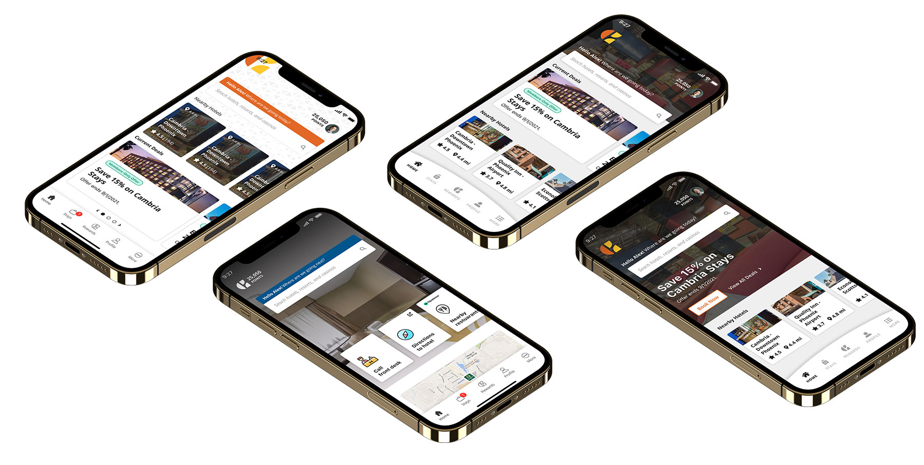
After months of development, design, and testing, we launched digital check-in to a select few hotels. We were delighted to see the launch was super successful, but any details I can’t post here (obviously). The good news is within 3 months we launched digital check-in to every Cambria Hotel across the country. Huzzah!
The bare bones is just the beginning, and what many of us see is endless possibilities with growing the mobile app overall.
In retrospect, there’s a few things I would have changed - one being the Home Screen redesign. It turned out amazing, but a bigger, atomic design approach to the app overall would have benefited better. And I personally would have separated that project into its own initiative, rather than tying it to digital check-in. The good news is the new Home Screen design is live, and we are actively updating the design system as I type this.
Want to know more? Let’s talk: email me at contact@joshuareach.com to set up a time to chat.